CLIENT
Ciccone
TIMELINE
4 MONTHS
ROLE
LEAD UX/UI DESIGNER;
LEAD GRAPHIC DESIGNER
TOOLS
FIGMA; ADOBE CS; QUALTRICS
TEAM
3 PEOPLE

A winery rebrand that stands out in a material world.
01
Created as part of a class project, this brand redesign for Ciccone Vineyard & Winery draws bold inspiration from Madonna’s most iconic moments to reimagine the visual identity with playful, culturally rich iconography. Incorporating elements like cone bras and rosary beads, the concept pays tribute to both the pop icon’s legacy and her family’s winemaking roots. The result is a label system and visual language that’s expressive, memorable, and distinctly Madonna — a perfect fit for a wine that embraces artistry without taking itself too seriously.


02
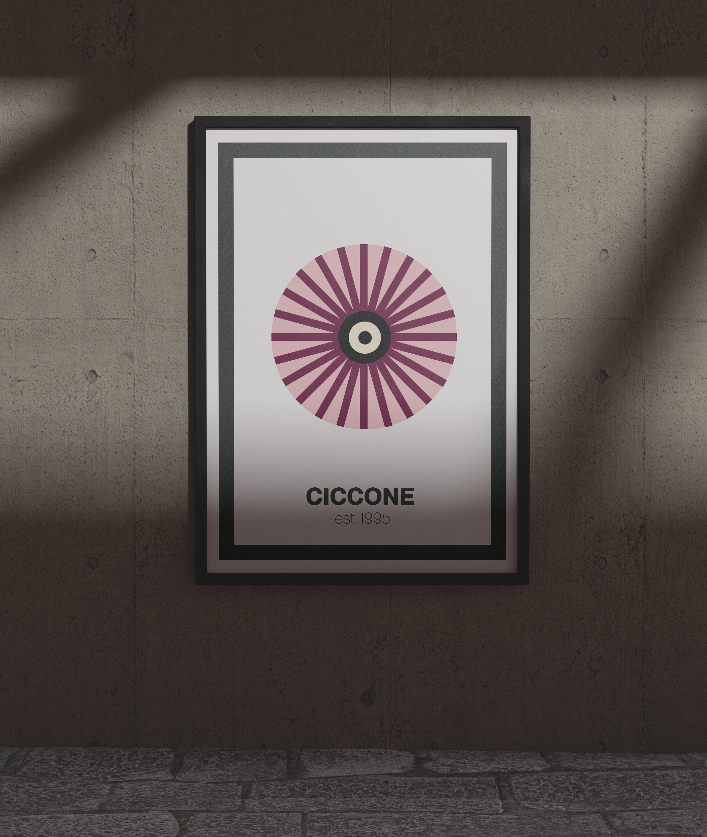
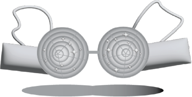
Logo Creation
The logo is built around a simplified interpretation of Madonna’s iconic cone bra — a subtle yet bold nod to pop culture history. By abstracting the shape into a clean, graphic form, the mark becomes both instantly recognizable and versatile, capturing the brand’s playful, provocative spirit without feeling heavy-handed.


BRANDING
Visual Identity


BRANDING

App Experience
03
PROTOTYPING
To extend the Ciccone brand experience, I designed a companion app that blends utility with personality, translating the winery’s visual identity into a warm, expressive digital experience. The interface balances elegance and playfulness through rich color, intentional typography, and tactile interactions, while still prioritizing clarity and ease of use for in-person and on-site contexts.


The profile page helps users track rewards, purchases, and favorites — from go-to wines to curated pairings.
A playlist feature pairs each bottle with a curated soundtrack, turning wine nights into full sensory experiences.

The explore page makes discovery intuitive and visual, with custom UI components that let users search by body, composition, or tasting notes.

The purchase flow is clean and streamlined, making it easy to buy a bottle or case directly from the app.
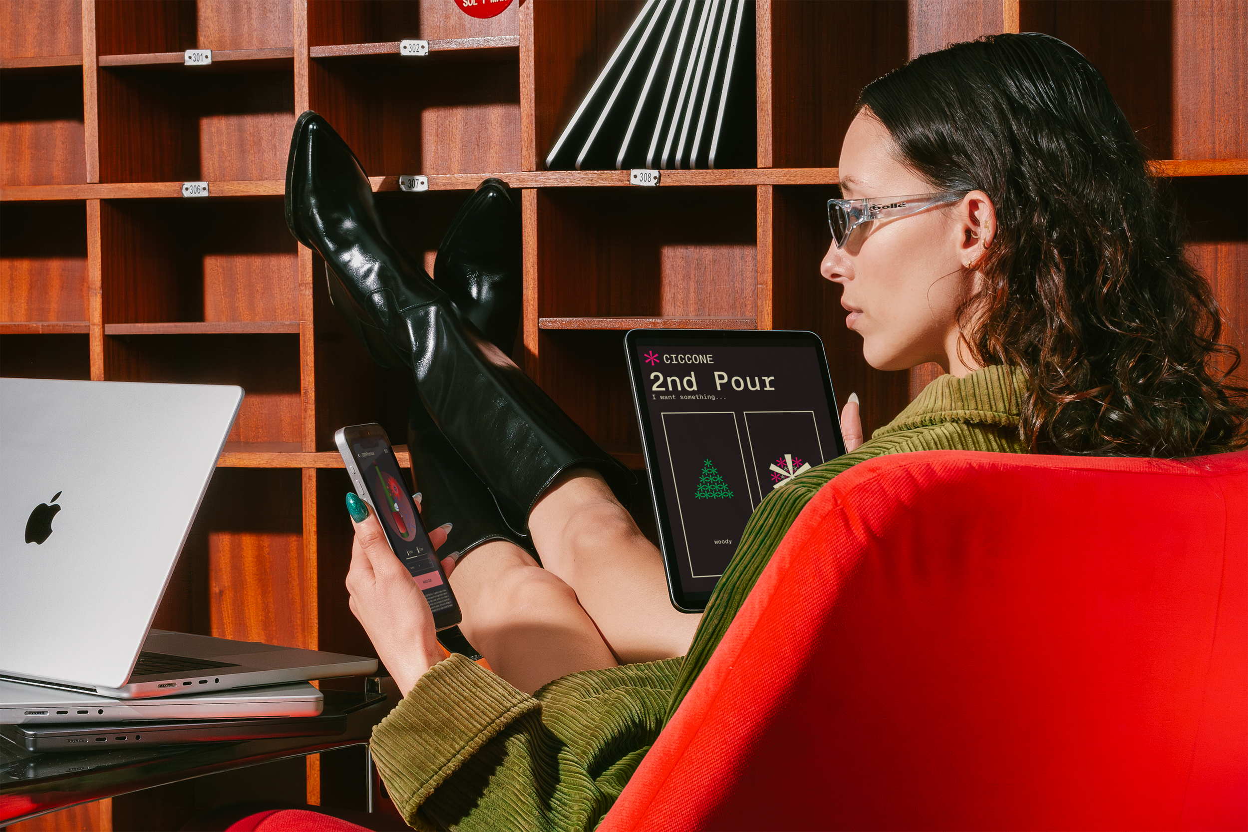
PROTOTYPING
Ordering in Poor Connection
Knowing that wineries are often located in areas with unreliable internet, I designed an offline-friendly iPad version of the Ciccone app for use directly at the winery. To optimize performance, I stripped the visuals back to the essentials, using asterisks as the building blocks for the graphics and selecting default web-safe colors. This ultra-minimal approach reimagines the logo in its simplest form while still preserving the brand personality. The result is a lightweight, functional ordering experience that works seamlessly even in low-connectivity environments.


04
PRODUCT DESIGN
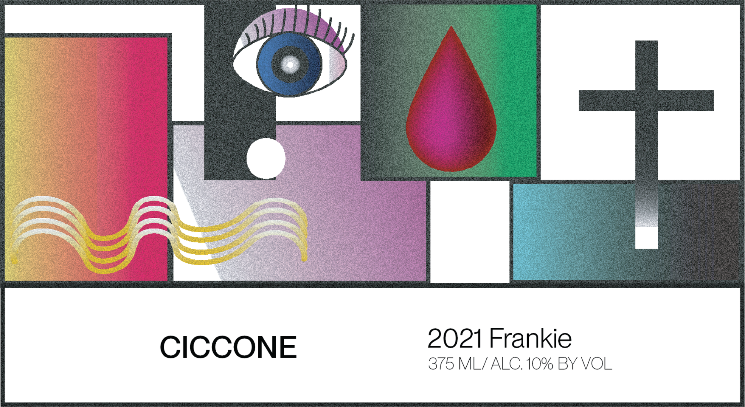
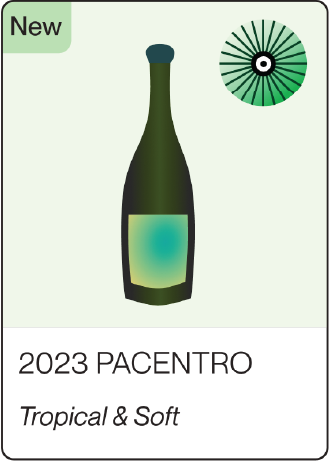
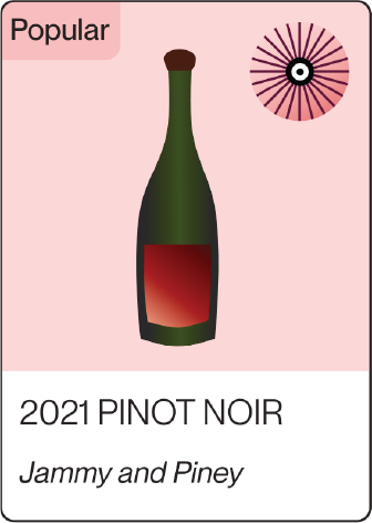
Wine Labels

I illustrated a series of three wine bottle labels that bring a whimsical, artistic flair to the Ciccone brand while still honoring the craft of winemaking. Each label includes subtle nods to Madonna, creating a layered experience for fans and newcomers alike. The designs strike a balance between fun and refinement, inviting wine drinkers from all walks of life to enjoy the story behind every bottle.