


01
CLIENT
NOAA
TIMELINE
4 MONTHS
ROLE
LEAD UX/UI DESIGNER;
UX RESEARCHER
TOOLS
FIGMA; ADOBE CS; QUALTRICS
PURPOSE
Supporting protection of the Great Lakes through smarter design.
This project was completed as part of a user experience design course in collaboration with a real-world client: the Great Lakes Aquatic Nonindigenous Species Information System (GLANSIS), a database used by researchers, educators, and policymakers to track invasive species in the Great Lakes.
The GLANSIS team approached me with a clear challenge : their site was outdated, difficult to navigate, and overwhelming to use.
My goal was to explore ways to improve the site’s usability, structure, and visual clarity.
Through research, ideation, and iterative design, I worked to reimagine GLANSIS as a more accessible, intuitive tool that better supports conservation efforts and informed decision-making across disciplines.
RESEARCH
Client Insight

To understand the specific needs behind the redesign, I conducted informal Q&A sessions with GLANSIS staff. These conversations helped define user needs, pain points, and internal goals.
Purpose of interviews:
Clarify site objectives and value proposition
Understand primary user groups and their goals
Identify internal frustrations with current layout and functionality
Key insights from staff:
Frequent pain points: hard-to-find data, unclear search pathways, outdated visuals
Primary user groups:
Scientists and researchers
Educators and students
Environmental policymakers
General public with ecological interest
Internal priorities included:
Making the site more approachable without sacrificing rigor
Improving content update workflows
Highlighting impactful species stories and educational tools
02
IDENTIFYING ISSUES
Problem Statement
03
The NOAA Great Lakes Aquatic Nonindigenous Species Information System (GLANSIS) is a critical resource designed to provide accurate and accessible data on non-native aquatic species in the Great Lakes region. However, despite its scientific value and expanding dataset, the website is not effectively serving its highly diverse user base—which includes Great Lakes researchers, natural resource managers, aquatic invasive species (AIS) decision-makers, and K–16 educators.
Users reported significant friction when navigating the platform:
Outdated visual design hindered credibility and engagement
Poor navigational flow created confusion
Species Profile Pages, central to the platform’s purpose, were cluttered and hard to digest
Difficulty returning to the homepage made exploration frustrating
DEFINING SOLUTIONS
Key Design Decisions
To improve clarity, usability, and engagement across the GLANSIS website, I grounded my redesign in a series of strategic design decisions informed by comparative analysis of similar ecological data platforms and in-depth interviews with GLANSIS staff. These insights helped ensure the site effectively supports both expert users seeking detailed scientific data and casual users looking for accessible, intuitive pathways to understand complex ecological information.


Establishing Hierarchy and Flow through Typography, Color, and Grouping
Simplified, Versatile Filtering with Organized Results
Orienting Users with Cards, Tabs, and Breadcrumbs
Engagement Features: “Species of the Day” and “More from GLANSIS”
04

Initial Brainstorming
DEFINING SOLUTIONS
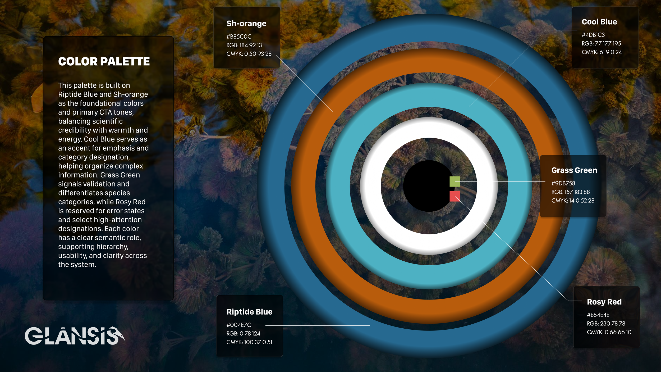
Design System
05
01: Establishing Hierarchy and Flow through Typography, Color, and Grouping
DESIGN RATIONALE
A clear visual hierarchy across all pages was introduced by using:
Consistent typographic scales for headings, subheadings, and body text
Strategic color usage to draw attention to interactive elements and key actions
Logical grouping of related content using spacing, lines, and background contrast
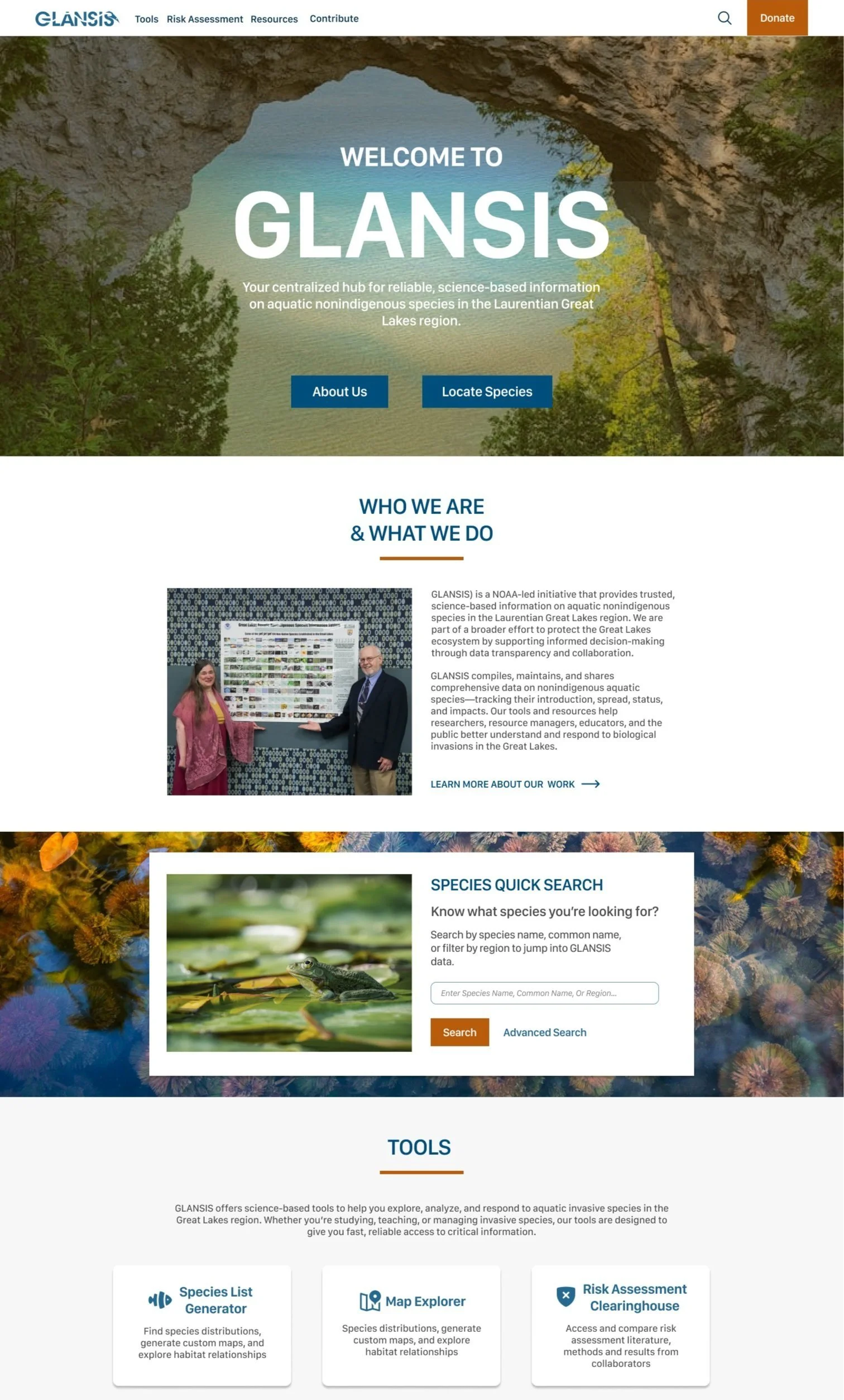
Section of the Redesigned Homepage
Clearer font hierarchy and established structure for content sections to allow for faster navigation.
Accessible Species Quick Search section with improved font hierarchy and color scheme.
Defined/ descriptive header structure and brightly colored CTAs.
DESIGN RATIONALE
02: Simplified, Versatile Filtering with Organized Results
To streamline the experience of searching for species:
I implemented a unified filter design across search, profiles, and the map interface
Filters are placed in intuitive locations (above results, not hidden in sidebars)
Results display in clean, card-based layouts, showing relevant species data (name, status, image, location stats) at a glance
This system supports both quick searches and in-depth exploration, without requiring deep familiarity with the platform.
Section of the Redesigned Search Results Page
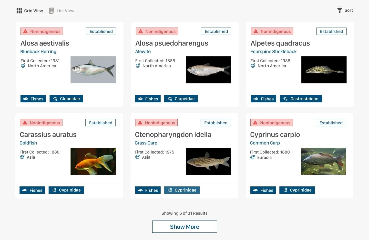
Breadcrumbing to orient user by providing where they have been and where they are now.
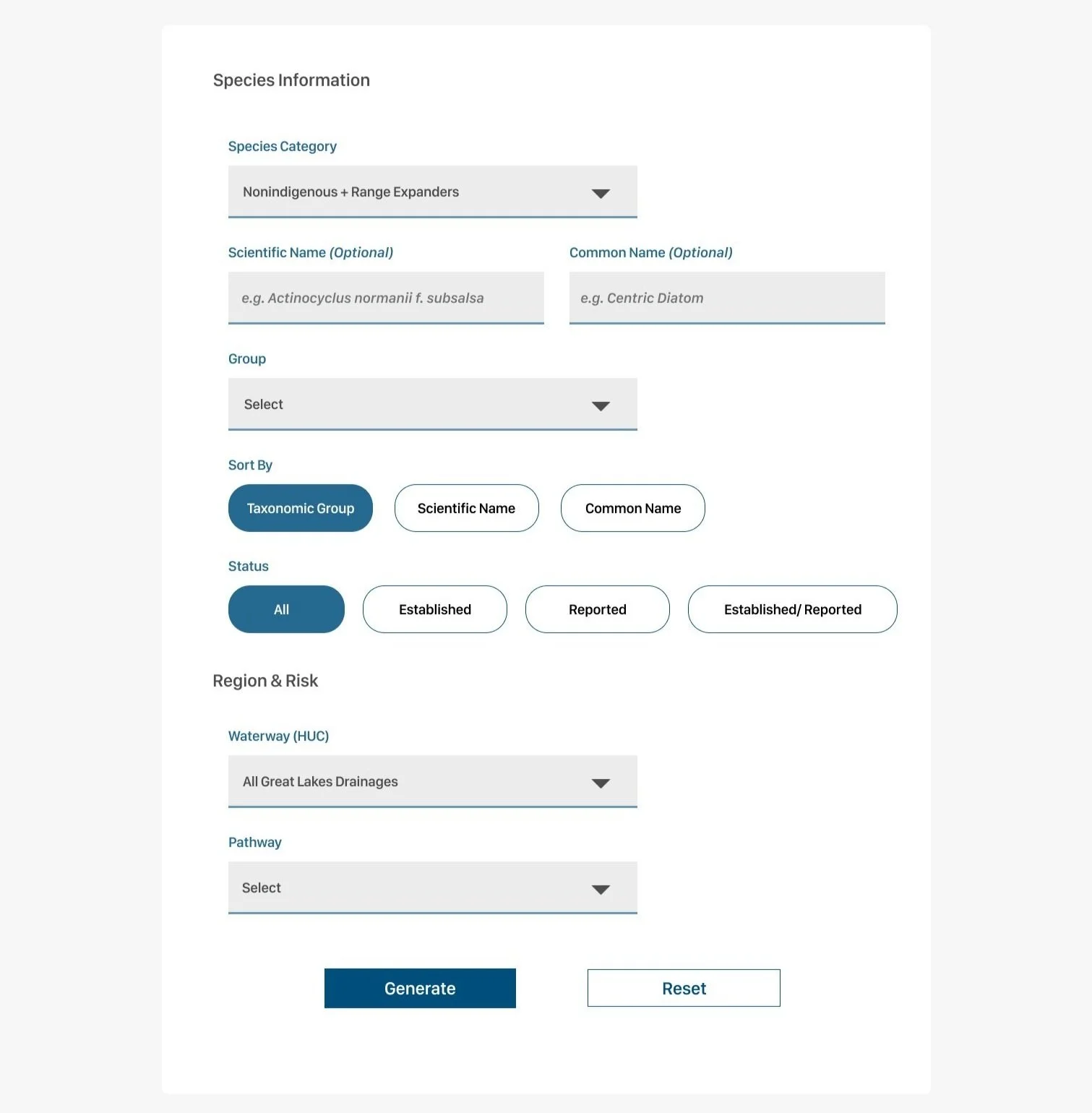
Section of the Redesigned Species List Generator
DESIGN RATIONALE
03: Orienting Users with Cards, Tabs, and Breadcrumbs
I addressed client concerns about users feeling “lost” by:
Using cards to break complex information into manageable chunks
Organizing dense profile content into tabs, reducing cognitive load
Implementing breadcrumb trails for improved wayfinding across multi-step journeys
These tools help users stay grounded as they navigate between tools, profiles, and content-heavy pages, which is especially important given the depth of scientific data GLANSIS provides.

Section of the Redesigned Species Profile
Tabbing to chunk related information.
Grouped tools section to improve visibility and showcase usefulness.
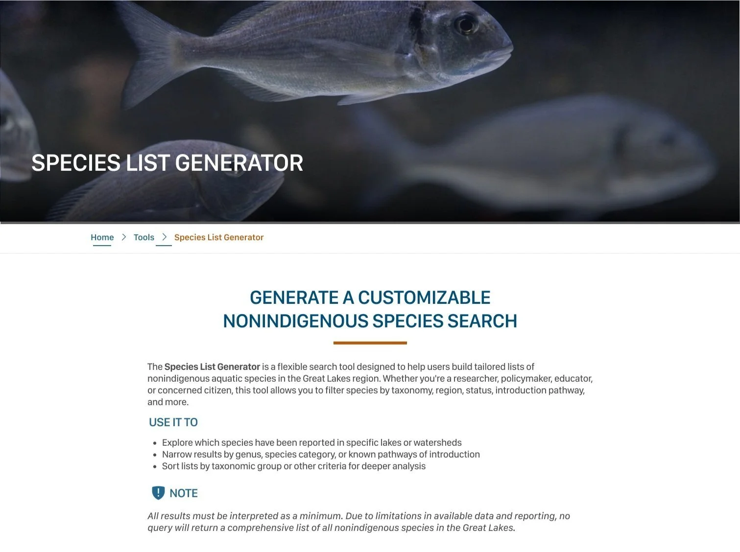
Section of the Redesigned Species List Generator
DESIGN RATIONALE
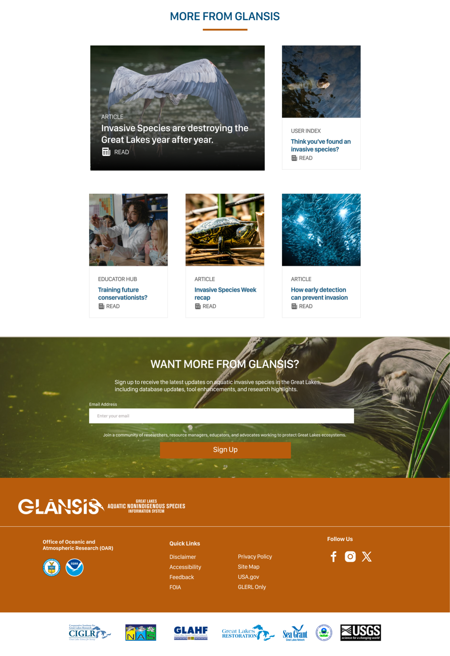
04: Engagement Features: “Species of the Day” and “More from GLANSIS”
To foster ongoing interest and highlight the conservation mission of GLANSIS:
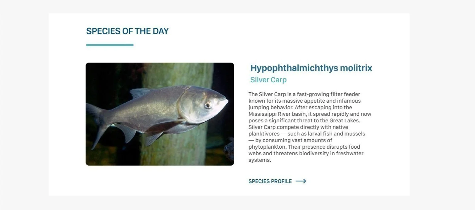
I added a “Species of the Day” feature to spotlight unique or urgent species
A “More from GLANSIS” section promotes blog posts, conservation news, or educational tools
These components create fresh, dynamic entry points into the site’s core resources, helping return users find something new and inviting casual users to learn more.
Sections of the Redesigned Homepage Features
PROTOTYPING
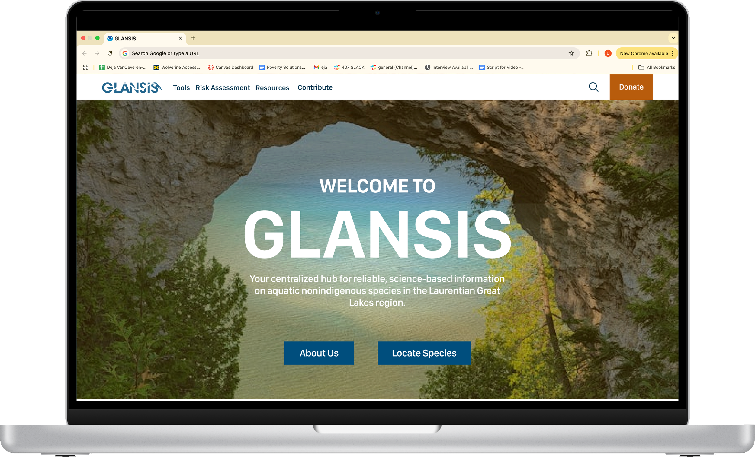
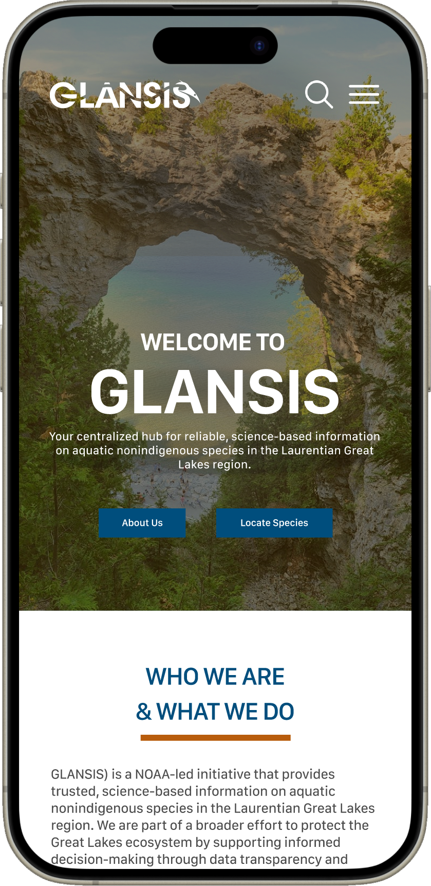
Homepage Overhaul
The redesigned homepage introduces a clean, modern layout with clearer navigation, featured species highlights, and engaging entry points into GLANSIS tools and conservation content.
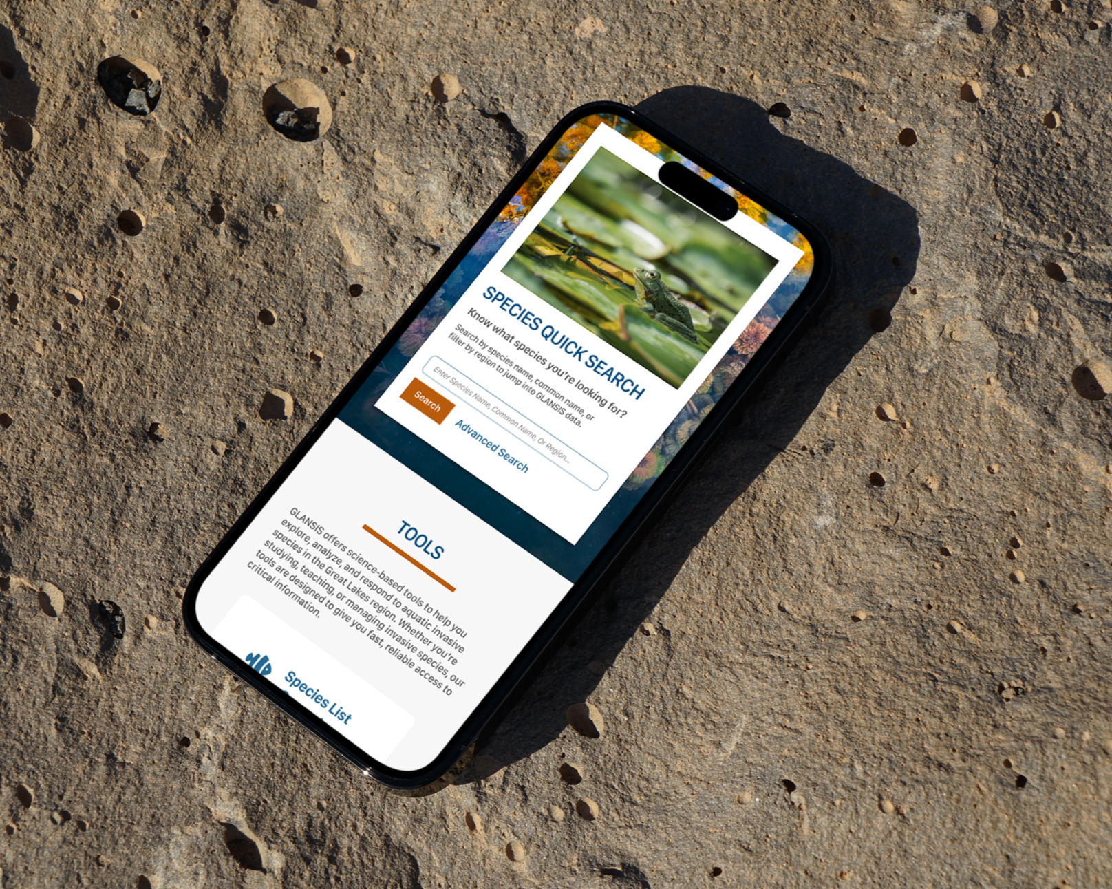
PROTOTYPING
Species List Generator Tool
The updated tool offers an intuitive filtering experience with instructional guidance and displays results in visually consistent, card-based layouts that emphasize key species stats.
PROTOTYPING
Individual Species Profile
The restructured species profile organizes dense ecological data into tabbed sections, using visual hierarchy and breadcrumbing to improve readability and orientation.