welcome home.
loomhouse is a creative studio built around storytelling, craft, and care. The brand is meant to feel human and expressive, with a quiet confidence that comes from thoughtful design rather than perfection. Every element of the identity was created to feel warm, approachable, and grounded.
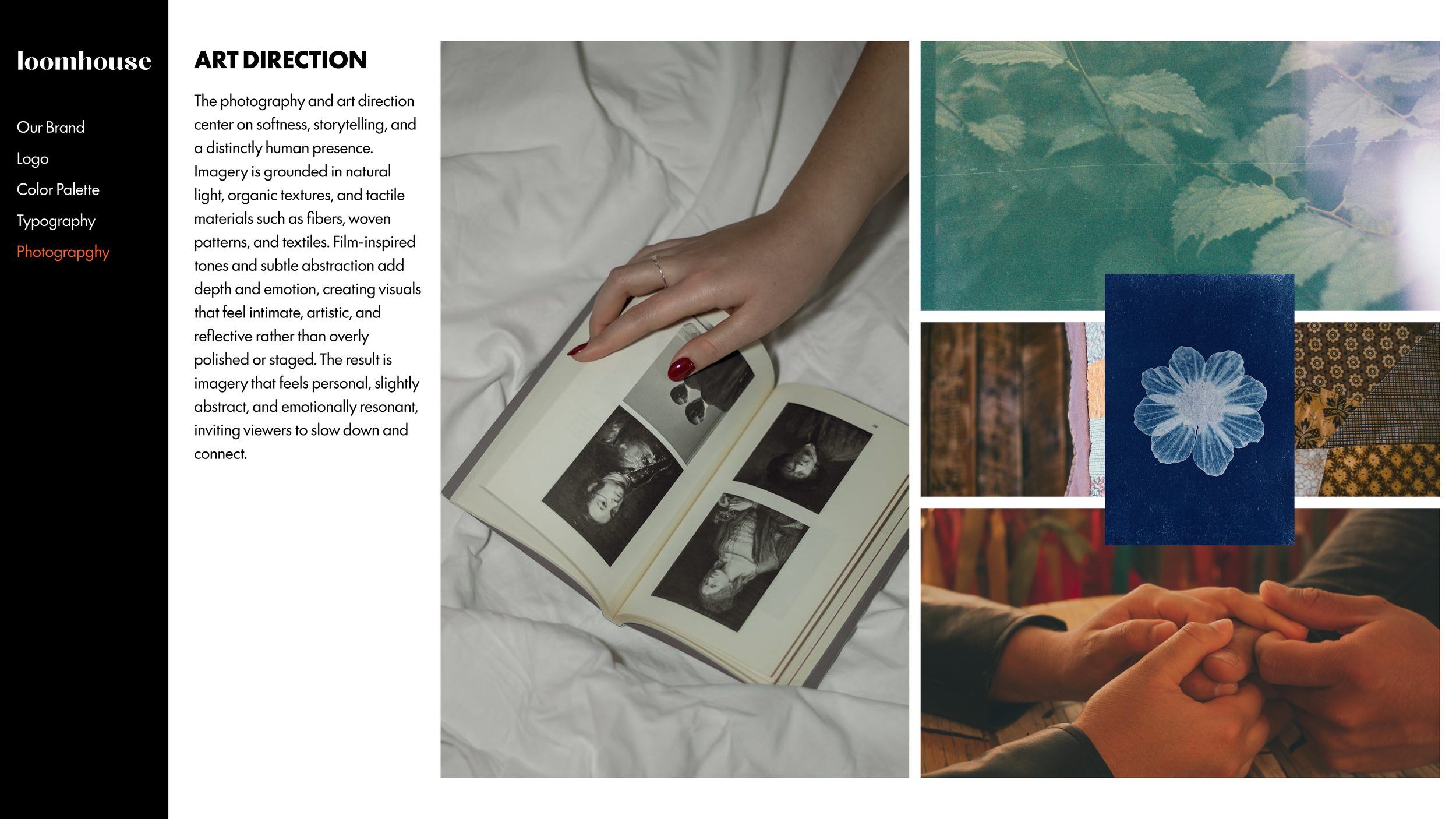
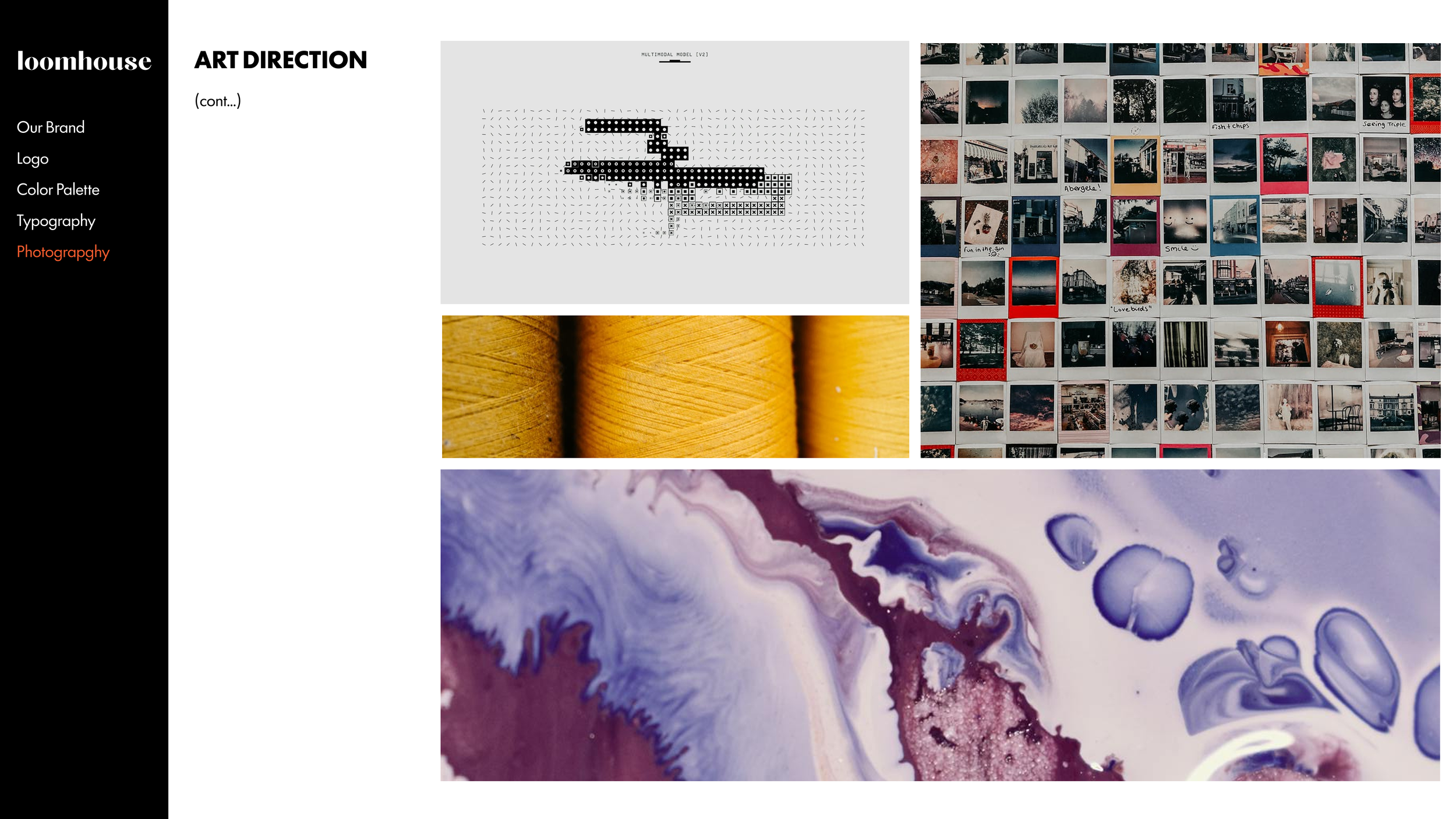
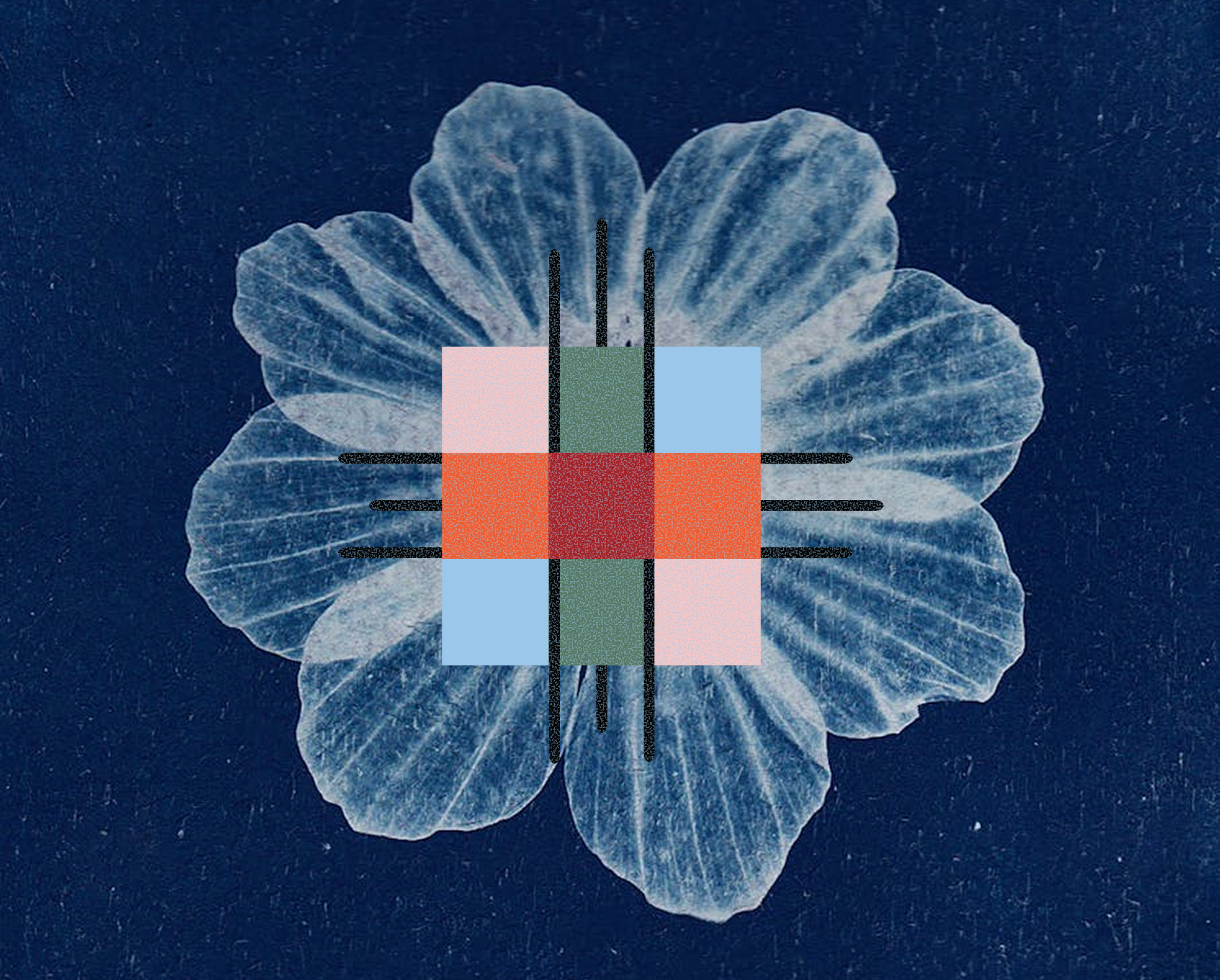
The Loomhouse project grounded the creative process by anchoring design decisions in real materials, shared work, and physical making. The visual system was built around intentional contrast rather than trend. Brighter colors introduced energy and personality, while softer, muted tones created breathing room and balance so the palette felt lively without becoming overwhelming. Typography was approached as a functional design tool shaped by real use cases. The primary typeface brought warmth and character that reflected the studio’s creative voice, while the secondary typeface provided structure and clarity for longer content, establishing a hierarchy that felt expressive but grounded. Photography and art direction reinforced this philosophy through natural light, film-inspired tones, and tactile details like fabric, wood grain, and pattern. Instead of a polished or overly refined aesthetic, the visuals embraced texture and imperfection, highlighting the hands-on, collaborative nature of the work and creating a sense of closeness and intention throughout the project.

Logo Design
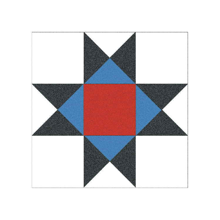
The logo is inspired by woven materials and pattern making, reflecting the idea of bringing many threads together into something cohesive. It is flexible by design and works across both digital and physical spaces while maintaining a consistent, recognizable presence.