

ROLE
LEAD UX/UI DESIGNER;
UX RESEARCHER
CLIENT
UM POVERTY SOLUTIONS
TOOLS
FIGMA; MIRO;
ADOBE CS; QUALTRICS
TIMELINE
9 MONTHS

OVERVIEW
Poverty Solutions: a UX audit with a cause.
Poverty Solutions is a University of Michigan initiative dedicated to advancing research-driven policy solutions and leveraging academic expertise to address the root causes of poverty.
To improve content discoverability, navigation, and overall usability, I conducted a website audit that revealed key pain points in how key users navigate and find information.
My redesign focused on improving clarity, reducing cognitive load, and helping all users quickly access the information that matters most to them.

HOW MIGHT WE
Challenge
The redesign needed to make the site more intuitive and user-friendly while supporting Poverty Solutions’ mission of connecting research to real-world impact, all within University of Michigan brand guidelines and technical constraints.
While the site offered valuable content, it was difficult to navigate and overwhelming to use. Key challenges included:
Complex navigation that made it hard to locate reports, initiatives, and event details

A dense site structure that buried important content and confused visitors

Accessibility gaps that limited usability for some audiences

Missed opportunities to highlight ways to connect, such as newsletters, events, and student programs

IMPACT
“I feel as if Poverty Solutions does a lot of really terrific work and of considerable value. I feel like I know that, but the website doesn't really strike me that they're doing such valuable work.”


Participant 7, Policy Researcher
RESEARCH
Methods and Insights
-
Purpose: Explored stakeholder needs and expectations through semi-structured interviews.
Recurring Themes:Navigation Confusion: Categories like “Key Issues” and “Data Tools” were too broad.
Outdated Content: Reduced credibility (e.g., “2024 Election Issues Guide”).
User-Specific Needs:
Policymakers: Clearer collaboration guidance.
Students: More prominent research opportunities.
Visual Design: Dated and cluttered layout.
-
Purpose: Simulated real-world tasks to identify navigation challenges.
Challenges Identified:Homepage Design: Cluttered, too long, and overwhelming for users. No clear introduction to what the organization does.
Values Section: Hard to locate.
Research Reports: Mixed success in finding specific reports.
Upcoming Events Section: Overlooked due to lack of prominence.
Search Functionality: Inconsistent results, lack of filtering options, lack of metadata, and no spelling tolerance to handle typos.
Ease of Overall Navigation: Participants lacked clear sense of direction, often confused by how they got to a specific page or how to find a page they were just on
-
Purpose: Provided insight on information architecture based on user input.
Insights:Category Ambiguity: Labels like “Key Issues” and “Data Tools” were unclear.
Overlapping Content: Users expected certain resources in multiple categories.
Action-Oriented Labels: Users preferred descriptive, purpose-driven labels.
-
Purpose: Collected broad feedback on navigation and satisfaction.
Survey Highlights:User Roles: Researchers (42.9%), policymakers (14.3%), students (14.3%).
Frequency of Visits: 71.4% visit monthly.
Ease of Finding Information: 42.9% rated it neutral (3/5).
Suggestions:
Add a “Poverty 101” page for beginners.
Improve visual design and font consistency.
-
Purpose: Used to identify usability issues in a system by evaluating it against established principles of good design.
1. Visibility of System StatusIssue: Key content like “Values” hard to locate.
Potential Fix: Consolidate org descriptions into one section.
2. Match Between System and the Real World
Issue: Site name misleads users into thinking it's for individuals in poverty.
Potential Fix: Add clear purpose statement on homepage.
Issue: Nav labels like “Data Tools” are confusing.
Potential Fix: Refine and reorganize labels.
3. Consistency and Standards
Issue: Inconsistent button styles made actions unclear.
Potential Fix: Standardize interactive elements with distinct styles and placement.
4. Recognition Rather Than Recall
Issue: Users forgot where to find information due to lack of visual cues and discoverability.
Potential Fix: Add persistent navigation cues and contextual hints.
FINDINGS
User Personas
From the conducted research, it was determined that users generally fell into 1 of 2 categories:
1. The New/ Infrequent User: those unfamiliar with the site who often arrive with a specific goal or question but struggle to locate the information they need
2. The Seasoned User: those who regularly access specific information, research, data, or tools & need a way to streamline access


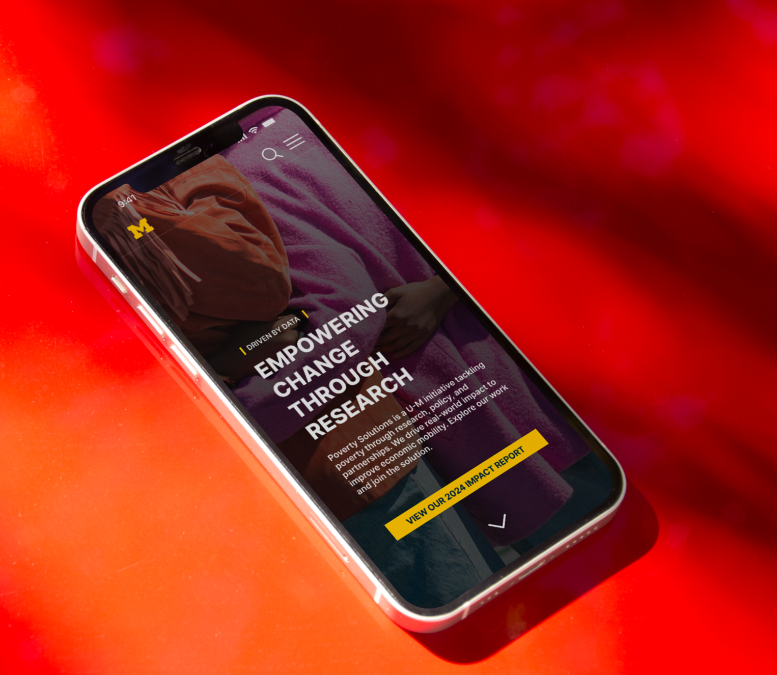
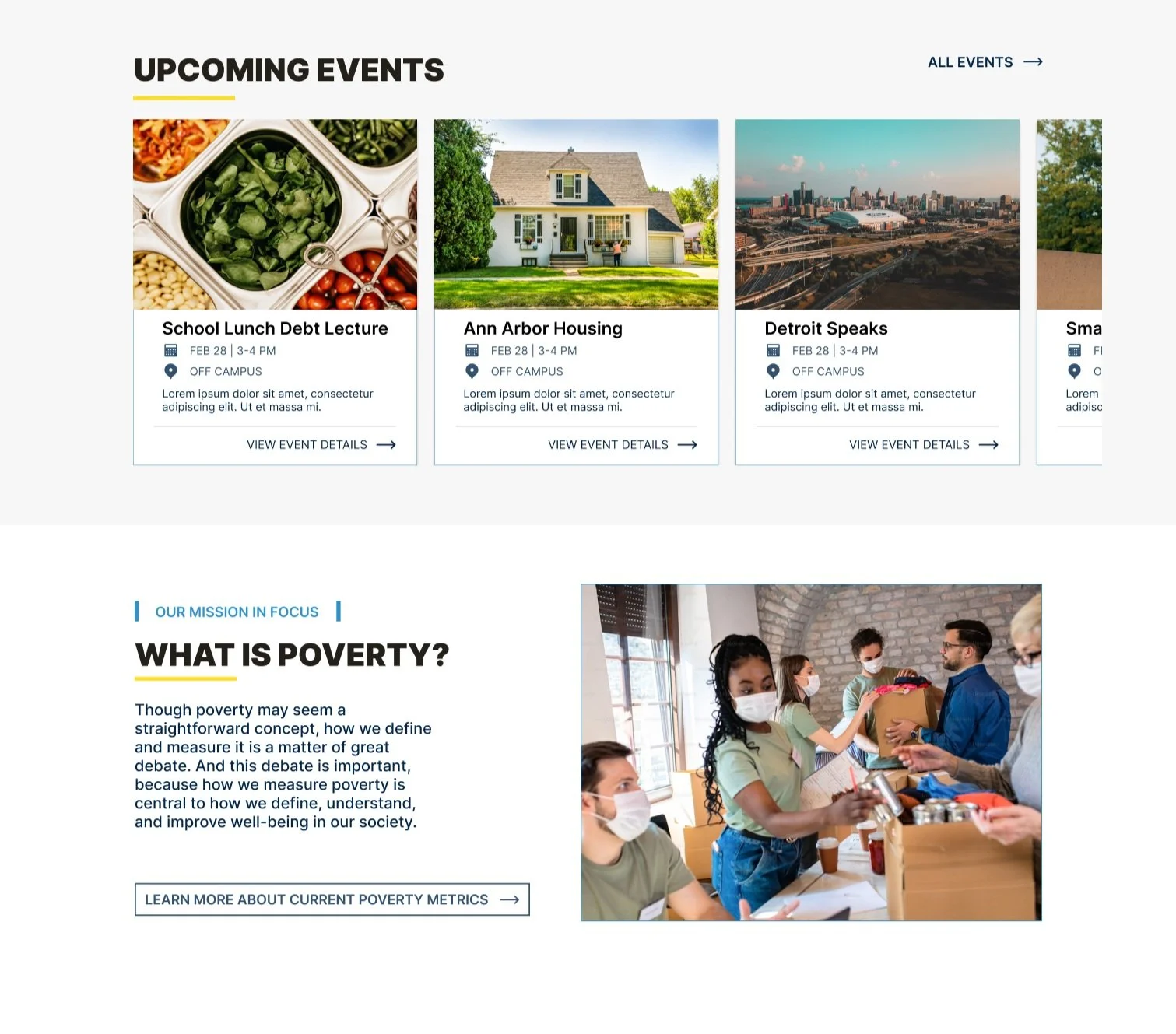
01: Developing a More Impactful & Informative Homepage
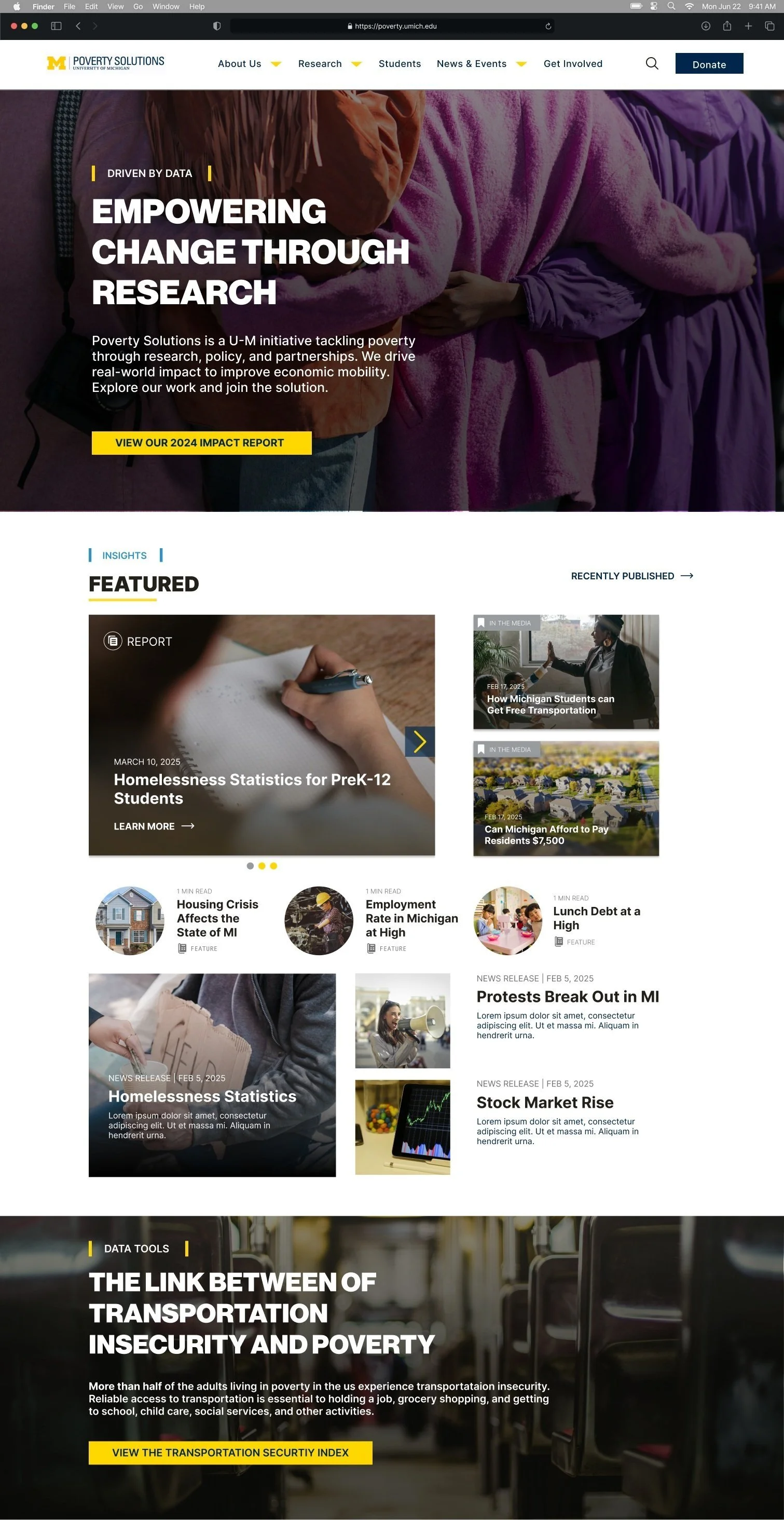
Simplified layout to reduce cognitive overload and highlight key resources.
Clearer navigation with more intuitive labels.
Prioritized featured research and news to increase visibility.
Actionable CTAs to boost engagement.
In line with what users reported during testing, the homepage was re-designed to properly orient site visitors and to provide faster access to vital information:
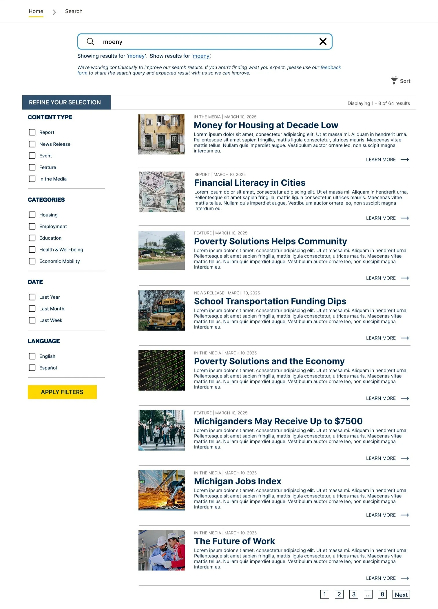
02: A Refined Search Function that Provides Descriptive, Filtered Results
Because the current site lacks filtering and sorting options, users found it difficult to complete tasks using the search feature. To address this and other search-related issues, the search experience was redesigned with:
Added publish date, content type, category, CTA, and thumbnail to each result for quick scanning.
Introduced left-side filters with checkboxes and dynamic filter chips for clarity and control.
Displayed total number of results and added typo-tolerant search suggestions.
Integrated a user feedback form to report search issues—supporting ongoing refinement.
Designed a more intuitive, responsive layout to help users find relevant content faster.

03: Simplified Site Navigation through Better Design
Restructured the main navigation menu with clearer, user-informed labels
Consolidated and simplified category groupings to reduce decision fatigue
Created consistent structures across key content pages
The original site structure made it difficult for users to locate key content quickly. To improve clarity and ease of use, the navigation was redesigned with more intuitive labels, simplified categories, and clear entry points tailored to both new and returning visitors.


PRINT MATERIALS
Poster Submission
